Blog - The Shūetsu font


 The Shūetsu font
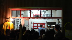
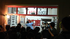
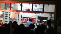
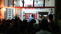
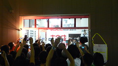
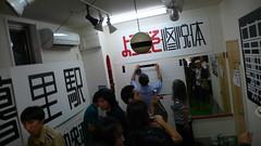
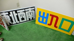
Last night we went to Kōenji to catch a live performance by Satō Shūetsu (佐藤修悦). His famous font, Shūetsu-tai (修悦体), has been seen by over a million people everyday in Shinjuku station, where he wrote temporary guidance and signs on the construction walls in 2004 using rubber tape, which I admired every morning myself.
Beyond the obvious utility, such as telling the way to platforms 5 and 6 through a temporary passage that might not exist a week later, his font is a precise art of tape sticking and cutting, with obviously quite a bit of planning before being executed.
At first the aligned tape didn't look anything like Japanese characters, but in the end it was a very cool 「感謝」 ("gratitude")... for being recognized as a unique font designer maybe?
Appropriately titled "genzaichi" (現在地, "You are here"), the exhibition goes on until Wednesday September 5, thanks to TrioFour.
Lately Satō Shūetsu's work can be seen in the wild at Nippori station. Also check out YouTube which has some documentaries about him.
Larger sizes and more photos at Flickr
Posted on September 3, 2007 at 19:20 | Tweet
|
Trackback
Comments RSS
Really cool fonts! Complex characters make Japanese a hard language for innovating on typography, so I really appreciate it when I can see new typefaces.
Posted by ale/pepino on September 4, 2007 at 09:29
I heard about this on TV. I must have seen those characters tens, or hundreds, of times, but never really thought how cool they were until they were highlighted on TV.
Posted by Ken on September 6, 2007 at 21:53


